Espo-sition
Absolute Powers
Everyone’s favorite sign-painter, Steve Powers, kicks it solo at Deitch Projects with ‘My List of Demands’. I haven’t seen a collection of his work since the Street Market show in the ‘Deitch garage.’ One of the many points of brilliance of that show was that it pumped up one of the simplest forms of authorship (the tag or signature) while fading out the individual artist. Sure, you could identify the individual tags and line work of Twist/Barry McGee, Reas/Todd James and Espo/Mr. Powers, but the free-flowing exchange of one-liners and inside jokes was the most artistically VISUAL representation of ‘three homies shooting the shit’ that I have ever seen. The written dialogue that the trio had carried on with others in the public realm as (graffiti) writers was translated into the space of a gallery. Now their materials were the partially realized chunks of the street itself… storefronts, signs, banners, wreckage.
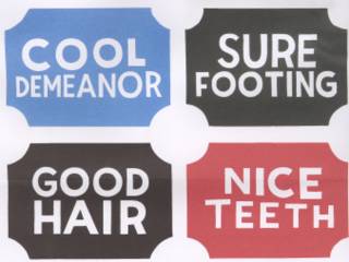
In Espo’s current one man joint you’re still in the midst of his communication with his boys but it’s less of a dialogue and more of a monologue. He continues kicking the one-liners in a series of panels covered with potential hipster t-shirt icons and slogans. The words “WHAT UP MY NUTRIENT” surround a pizza slice cartoon. A calendar-icon with legs runs after a knot-of-cash-icon over the phrase “A DAY LATE AND A DOLLAR SHORT.” These ‘logos’ are jumbled onto panels and fight for your attention. A few of the logos reappear as three-dimensional signage in the same room.
But in the larger gallery space Powers extends his speech into a short story. Using phrases that simultaneously recall ‘Dick and Jane books’ and a friend that’s slightly drunk, Espo recalls a story about schoolyard drama and revenge in a series of large ‘sign’ panels that step up and around the room. The strong graphic quality of the letters and illustrations continues Espo’s love of handcrafted signs. At first glance you can’t help but compare it to McGee’s combinations of figure and word but it really is closer to the storytelling work of Los Bros Hernandez, both in tone and line work (minus the word bubbles). But Powers manipulation of the ‘story boards’ takes effective advantage of the large room and signage legibility. He even manipulates the viewer’s body in a way that a graphic novel would never attempt to do but the best installation artists always consider. And of course he hits us with his zinger (as any great storyteller does) near the end of the tale. It’s a sign giving the results of a ‘sporting event’ that works on it’s own as a continuation of Powers’ graphic vocabulary but only gains meaning after the tale is told.
The most original piece is a stack of banners and awnings overwhelming the front façade of the gallery. The punchy phrasing and graphics are at their simplest but the wit ante is upped by the signs engagement with the neighborhood. Looking truly alien yet painfully familiar the awnings call out to the messy hodge-podge of Canal Street just down and around the SOHO corner… but feeling a world away.
posted by rio rocket valledor at 8:02 PM
![]()
![]()


<< Home